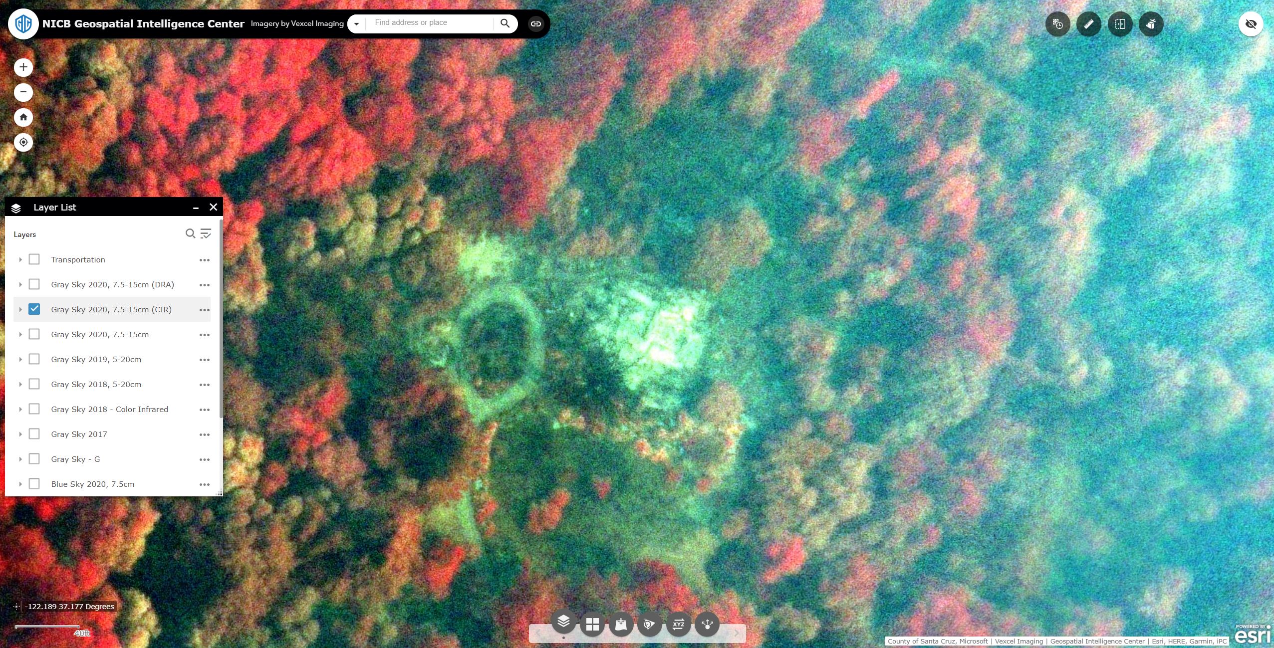
We collected and published thousands of square kilometers of imagery over the California wildfires last week. As is often the case with wildfire imagery, some areas were still in heavy smoke cover when we flew. But because we collect in the near-infrared (NIR) band along with traditional RGB, there is still a great deal of utility in the imagery for understanding damage to structures in the affected areas. Further, with some dynamic range processing, it is also possible to see a lot of detail that would otherwise be lost in the smoke. Both of these image types are available as distinct layers in our Esri based web viewer.
The image featured at the top of this post is an example of NIR imagery providing a good amount of detail for a property that would otherwise be nearly completely occluded with smoke. The same property is shown here in its original state, side by side with the version after dynamic range processing.
Here is another example with a heavier layer of smoke, along with the same near-infrared image. Although the NiR image may not look like a traditional RGB image you are used to, the information gleaned from it can help first responders make faster, more informed decisions in planning and logistics.
High res ortho imagery in the wake of Hurricane Laura is available for the Lake Charles region, among other areas hit hard by the storm. In this post we’ll look at the tools available in the GIC web application for Insurers to analyze their PIF or other point data sets.
The features of the viewer that we’ll focus on are:
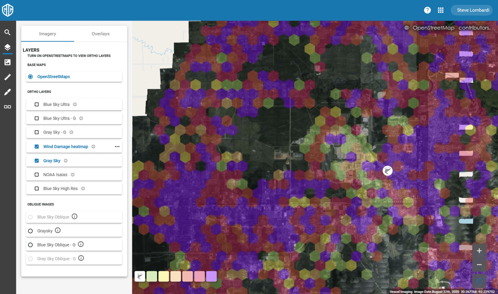
Start by going into the viewer and searching for Lake Charles, LA. Zoom out to get an overview of the area with just the gray sky layer turned on as shown here
Next turn on the wind damage heatmap in the layer control. This layer is created by our partners at Munich Re using computer vision to analyze all properties in the affected region. This is a simple and very effective tool for understanding where damage in the region is greatest. As you can see here, there are almost no parts of lake Charles without at least moderate damage. The color ramp goes from light green through red and then violet indicating increasing levels of damage. Zoom in on an area and note how the hexagons ‘unfold’ to reveal more detail as you go, turning off at street level to clearly show the imagery. You can of course toggle the layer on/off at any time as well.
The Lake Charles area is approximately 900 square kilometers, far more than you could manually inspect for damage hotspots so the heatmap overlay is a very helpful tool to draw your attention to the areas of imagery with significant damage.
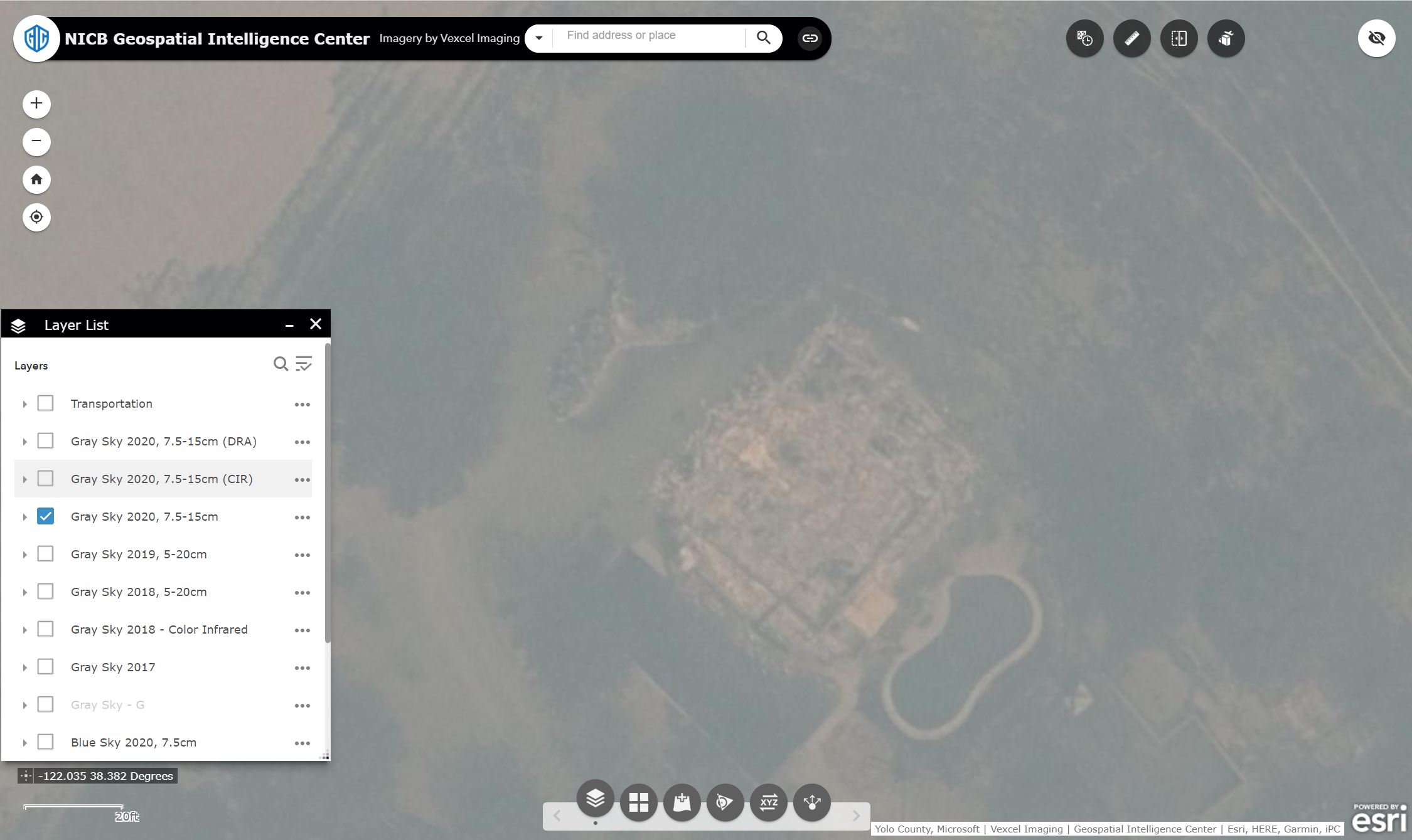
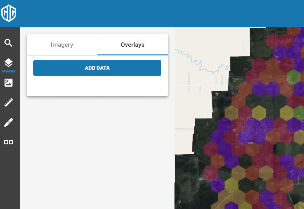
Next we’ll look at the data import functionality in the application. This feature is still in ‘preview’ with some added capabilities on the way, but even in the preview stage, it brings important analysis capabilities to your toolbox. You can import a variety of file formats including .KML and .SHP files, but for this tutorial we’ll use the common comma separated values (CSV) file that can be exported from Excel or any database tool. Your CSV file should contain fields for Latitude and Longitude in the first two columns, and any additional fields after that. The values in columns 3 and 4 are also important as they will be used as labels in the app.
The first line of your CSV should contain names for your fields. Latitude and Longitude should be labeled as shown, while the remainder of the labels can be whatever you like. Here is a sample that you can use:
Latitude, Longitude, AccountID, Name, notes 30.2309725, -93.3423869, P005IGPBW, Joe Smith, Your Note here 30.230995, -93.35050667, P005IGSFK, Mary Johnson, Another note here 30.233688, -93.343199, P005IGP80, Stan Lee, property note here.
Go ahead and get your CSV file setup, then come back and we’ll continue. You can save the 4 lines above in a text file on your local storage for a quick CSV file.
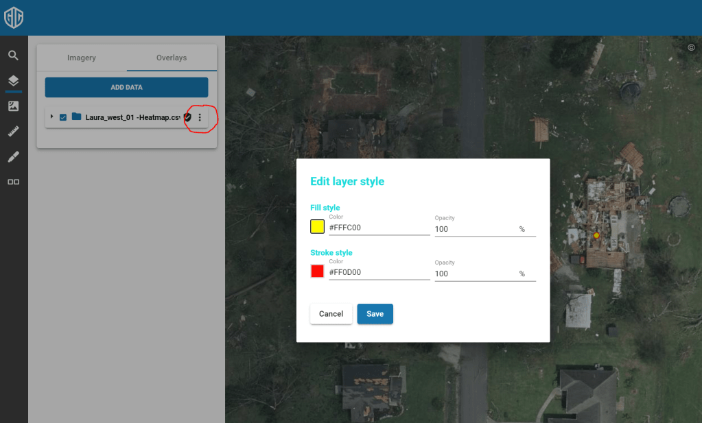
Importing is easy. Go to the Layer control in the left menu. At the top you will see two tabs; one for the imagery layers, and one for your own ‘overlays’. Choose the Overlays tab and hit the ‘Add Data’ button.
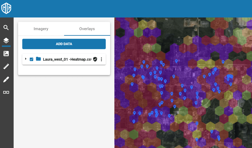
You can either browse to select your CSV file or drop it into the dialog. Either way your data is now added to the map as an overlay appearing as blue pushpins. You can toggle your layer on and off with the checkbox like any other layer.
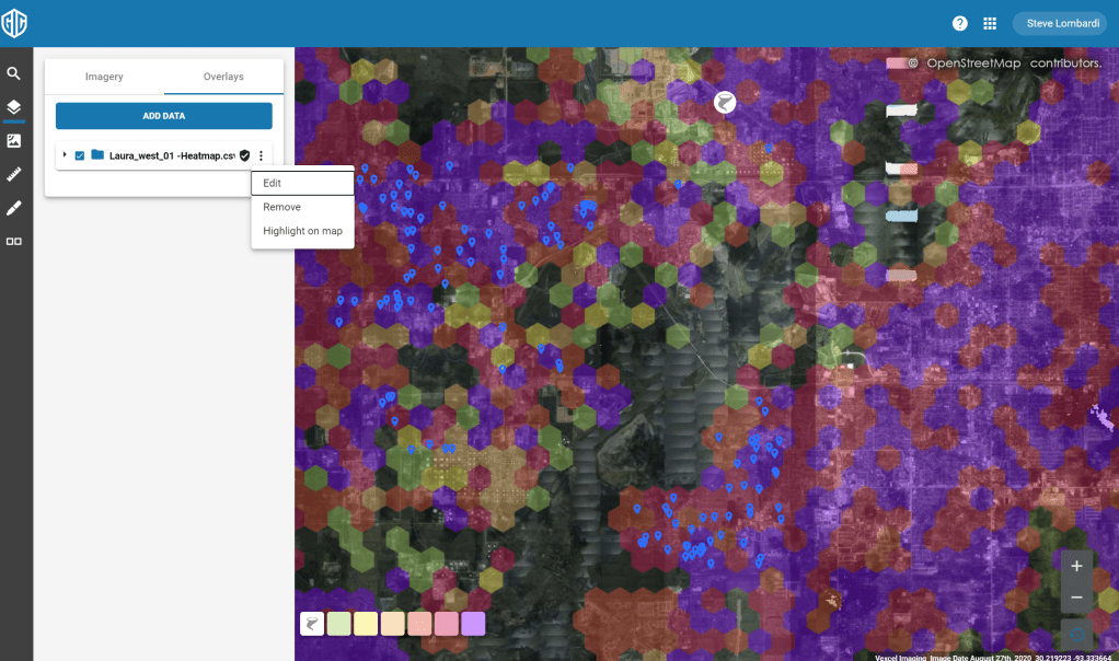
You can zoom out to see all of your points or use the ‘Highlight on map’ option on your overlay to automatically zoom out to a view that fits all of your points. You’ll find this menu choice on the … menu for your overlay as shown here:
You can change the style of your pushpins with the ‘Edit’ menu choice, also found in the … menu. Here I’ve gone with a yellow pin to really pop against the imagery
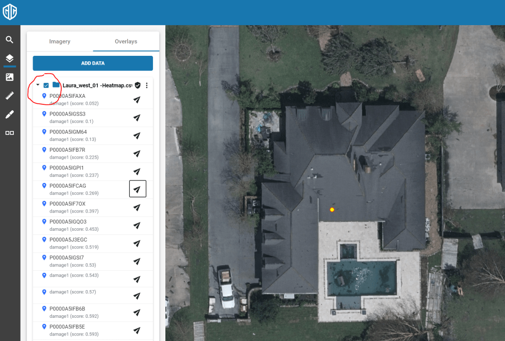
And finally, you can expand your overlay to see the individual points, labeled with fields 3 and 4 from your input file. Click the icon next to any of them to center and zoom the map on that point as shown here:
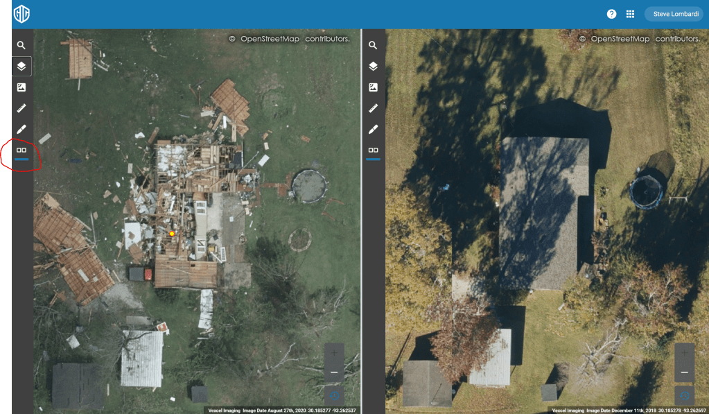
The viewer’s ‘Dual view’ feature is most often used for analysis when viewing catastrophe response imagery like our Hurricane Laura coverage. Turn it on by clicking the Dual view icon circled in the screen below. this will split the screen and provide separate layer controls for each side. In this image I have turned on the ‘Blue Sky Ultra-G’ layer with imagery from 2018. We also have 20cm imagery from 2019 in the ‘Blue sky High Res’ layer.
If you have any question on these features or any others, reach out to our tech support team at support@geointel.org
Our first round of collection for Hurricane Laura completed successfully yesterday, covering some of the hardest hit areas including Lake Charles, Beaumont and the gulf coast. Some samples are shown below at differing zoom levels; click each to view full screen and download.
We are continuing to collect today and invite GIC members, first responders, and state and local government to send their input to graysky@geointel.org
It is easy to overlay your own points of interest over Vexcel Imagery in common GIS tools like the Esri family of applications and QGIS. This is especially useful in Catastrophe response situations where insurers want to overlay their policy information over the graysky imagery.
In this tutorial, we’ll look at how to add Vexcel layers into QGIS, import your points of interest as an overlay, and do some simple analysis.
Before you get started, you should have an account providing data access to the Vexcel platform. If your organization has a license to our imagery and you need an account, email your request to support@geointel.org
Step 1: Install QGIS if you don’t already have it. It is a free download for all platforms. Install it from here.
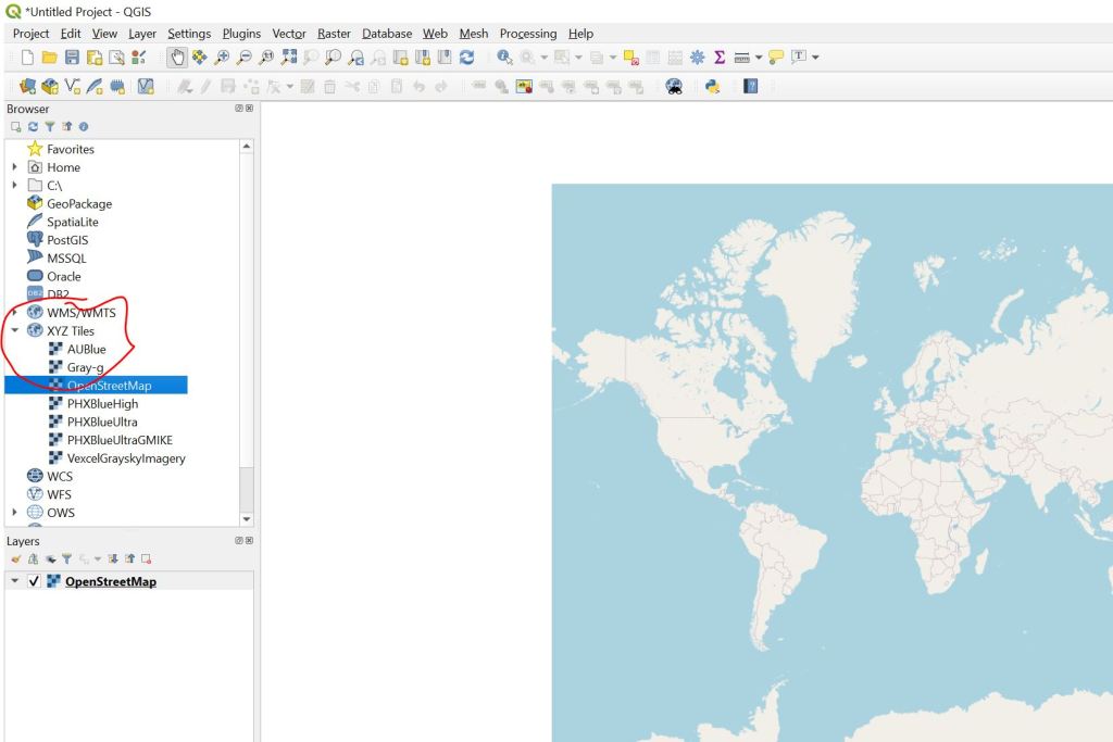
Step 2: Start QGIS and add the OpenStreetMap Basemap Layer. I start every project by adding this layer, providing a high quality backdrop for Vexcel Imagery. In the left rail menu, open the ‘XYZ Tiles’ section and double-click OpenStreetMap. the layer will be added to the map canvas and show up in the layer list below.
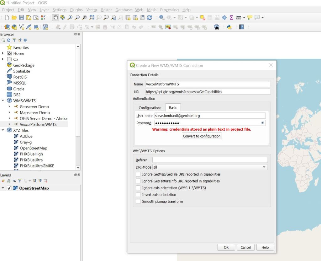
Step 3: Add the Vexcel WMTS Connection. Right Click on the WMS/WMTS section in the left menu and choose ‘New Connection…’. Give your connection a name like ‘VexcelPlatformWMTS’ and specify the URL as ‘https://api.gic.org/wmts?request=GetCapabilities’
In the Authentication section, specify your Username and Password for the Vexcel Platform. When your screen looks something like this, hit the OK button to initialize the connection.
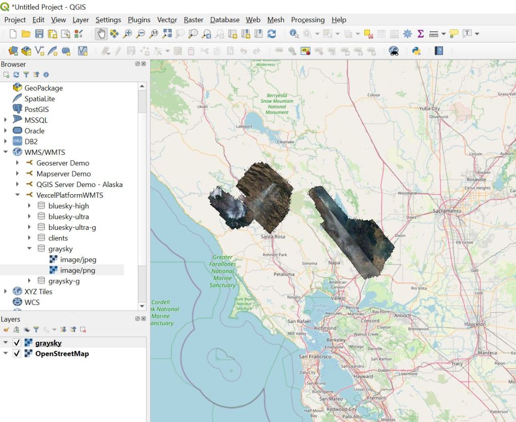
Step 4. Add a Vexcel Layer to the map. Once you’ve added the connection in step 3, all of the Vexcel Layers will appear below it. Double click any of them to expand it, then double-click on the ‘PNG’ option to add the layer to the map. We’re going to add the ‘graysky’ layer to pull in imagery from the California Wildfires. Hurricane Laura Imagery will appear in this layer as well as it becomes available.
Once the layer is added, zoom in the map north of San Francisco and you will see the imagery appear.
Step 5: Import your Points of Interest. In QGIS you can import data as overlay layers from a variety of formats. We’re going to import a simple comma separated file (CSV) exported out of Excel. Your data should have columns for Latitude and Longitude, along with any other fields of data you would like to bring along. Here is a simple CSV file that we are going to import:
In QGIS, Choose the Layer => Add Layer => Add Delimited Text Layer… Menu
Browse to select your file. QGIS will analyze it and try to find the latitude and longitude fields. Be sure the X field and Y field values match your data file. Once your screen looks something like this, hit the Add button to add your layer to the map.
You did it! Your points should appear on the map, something like this image shows.
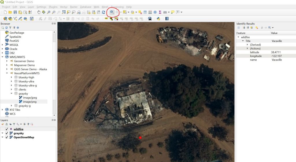
Here are a couple of QGIS tips. Use the ‘Identify Features’ button on the tool bar to click on one of your points to see the details as shown here.
At 100 PM CDT, the eye of Hurricane Laura was located near latitude 27.3 North, longitude 92.5 West. Laura is moving toward the northwest near 16 mph (26 km/h). A gradual turn toward the north-northwest and north is expected later today and tonight. On the forecast track, Laura will approach the Upper Texas and southwest Louisiana coasts this evening and move inland within that area tonight. The center of Laura is forecast to move over northwestern Louisiana tomorrow, across Arkansas Thursday night, and over the mid-Mississippi Valley on Friday.
National Weather Service forecasts include “unsurvivable storm surge” with large and destructive waves will cause catastrophic damage from Sea Rim State Park, Texas, to Intracoastal City, Louisiana, including Calcasieu and Sabine Lakes. This surge could penetrate up to 30 miles inland from the immediate coastline. Only a few hours remain to protect life and property and all actions should be rushed to completion.
GIC maintains activation Level 2 – Partial Activation for California Wildfires and Hurricane Laura as well.
Initial areas of interest for imagery collection have been identified for the following areas:
Ultra-high resolution – Lake Charles, Louisiana
Ultra-high resolution – Beaumont, Texas
Ultra-high resolution – Port Arthur, Texas
Multiple resolution – coastal collect from Cameron, Louisiana to Galveston, Texas
High resolution – multi-jurisdictional regional collect
As this storm make landfall, GIC members are strongly encouraged to share specific requirements and areas of interest for collection with the Gray Sky team by emailing graysky@geointel.org.
The Vexcel Web app is a powerful tool for accessing our entire imagery library. Although it is fairly intuitive to get started with, this post will provide a step-by-step quick-start for those of you wanting to access our disaster response imagery for the California fires. Additionally I’ll show the steps needed to turn on the ‘dual view’ feature enabling easy side by side comparison for before and after looks at a property.
Before you get started, make sure you have an account to access our web app at https://app.gic.org/ Accounts are free to first responders and state and local government agencies needing access. Members of the GIC also have unlimited site license to access the app. If you need an account email us at support@gic.org.
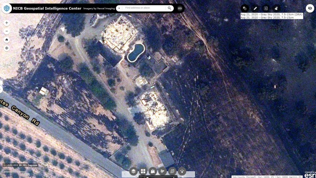
One more thing to understand as you go through this tutorial – ‘Graysky’ refers to our disaster response imagery, typically captured after a hurricane, tornado, wildfire, etc… while ‘Bluesky’ refers to our high quality aerial imagery captured with good weather conditions and sun angle. Our focus in this tutorial is to inspect a property damaged in the wildfires using our Graysky imagery, but then to use the Bluesky imagery to see what it was like before the fires.
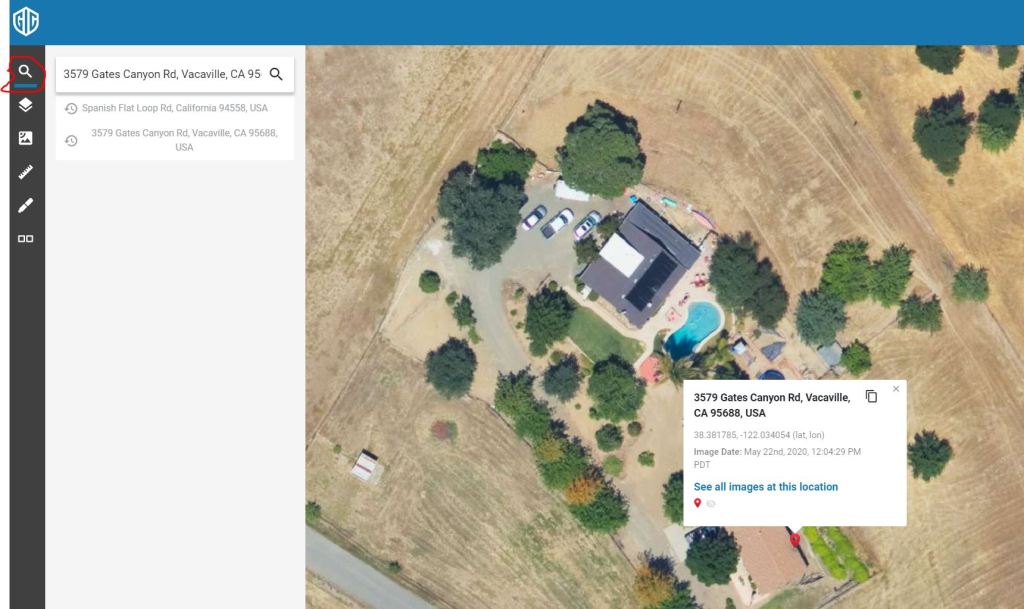
OK, with that housekeeping out of the way, lets get to it. We’ll use this address in the steps below: 3579 Gates Canyon Rd, Vacaville, CA
Step 2: The Search tool is at the top of the toolbar on the left side of the app. Enter the address and hit return. Like any other web map app that you have used, you can zoom with your mouse wheel, the + and – keys on your keyboard, or the zoom buttons in the lower right of the screen. If you have a touch screen (how do you work without one?!?) you can pinch to zoom as well. Go ahead and zoom in for a nice tight view of the property as shown below.
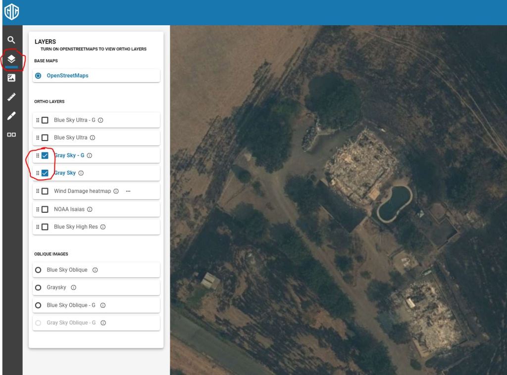
Step 3: The second icon down on the toolbar is the layer control. In a mapping app, typically the top most layer in the list is the one you are seeing on the map canvas. Since we want to see the wildfire imagery, uncheck all of the layers except for the Graysky layers. The date the image was captured is always shown in the lower right portion of the screen. You can also right-click anywhere on the map and choose ‘Get Info’ to display the address, coordinate and capture date. FOr our example address, we can see the image was captured on August 22nd.
Step 4: The Dual view icon is at the bottom of the toolbar on the left. Click it to split your screen in half providing two synchronized views. As you navigate on one side of the map, the other side will be kept in synch. Initially you will have the SAME layer visible on each side of the interface, but you can use the layer control on either side to change that. This feature is most often used to have Graysky on one side with blue sky on the other as shown here.
I hope you find this quick tutorial helpful in getting started viewing our disaster response imagery. The features shown here just scratch the surface of what you can do in our web application. If you want to learn more, I suggest checking out some of the videos in our help center or the Vexcel Viewer User Guide.
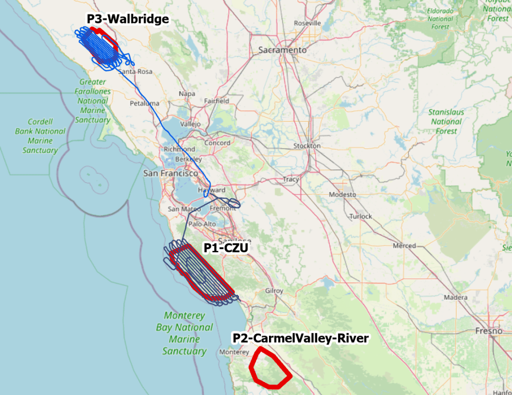
The GIC remains activated to Level 2 – Partial Activation for this event, with aerial imaging continuing today over Monterey County. Here are the details for todays update:
CZU Complex – Santa Cruz and San Mateo counties – imagery collected yesterday now published to GIC platforms
Walbridge Fire – Sonoma County – collected yesterday; imagery is shipping, will be processed late tonight, and available tomorrow morning
Carmel/River Fires – Monterey County – targeted for collection today
All imagery collected so far for this catastrophe is nadir 10cm resolution acquired with UltraCam Falcon.
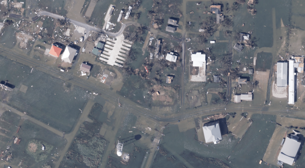
Firefighters continue to battle blazes across central and northern California. Two of the fires burning in California now rank among the top three ever recorded in the state. More than 1,500 square miles have burned. Over 1,000 homes have been destroyed. A Red Flag Warning is in effect for much of the hardest hit areas through Monday for dry thunderstorms.
More imagery from the Fires is being published today as we continue to fly and collect. We understand how important timely access to this imagery is. Please reach out if you need access.
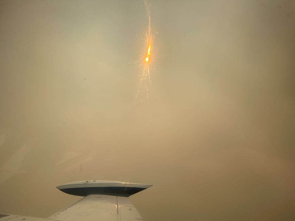
The cell phone photos below taken by the crew collecting the imagery are pretty telling. That’s some dense smoke right there, along with the dramatic shot of the fires burning off the wing 2000 feet down.
Initial imagery for the Vacaville fires is now online. If you are a first-responder, insurer, or government organization and need access, email your request to graysky@geointel.org.
If you are a resident of the affected area and concerned about your home, email steve.lombardi@geointel.org and I will send images if we have coverage.
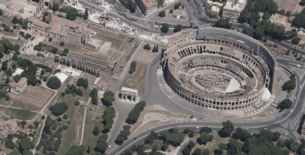
No doubt one of the most iconic structures ever built, the Colosseum has been a destination for families since 80ad. The 80,000 seat venue initially drew them in for the double feature of gladiator fights and lion feeding, while today the 4 million visitors each year stick to touring the underground passageways, posing for postcards in the square… and gelato. lots of delicious gelato.
Our flight over the city to collect 7.5cm resolution oblique imagery earlier this year presented the rare opportunity to see some of Rome’s architectural landmarks without the traffic and tourists. I’m looking forward to this area being published to our platform in the coming weeks and exploring it interactively.